Your Portfolio Should Look Like You
- design
- portfolio
- opinion
Until a few weeks ago, my portfolio looked like this: black background, a subtle grid, my name in a big bold sans-serif, a coral button, and a round headshot. It worked. It was clean, it was fast, and nobody would have complained about it.
The problem was that it could have been anyone’s.
So I redesigned it. Same pages, same sections, same content — and a completely opposite style: aged paper, Bodoni headlines, gilded frames, engraved ornaments, and a portrait of me in a 17th-century doublet, holding a laptop.
The dev portfolio default
If you’ve browsed developer portfolios lately, you know the look. Dark mode. A grid or a soft gradient in the background. A geometric sans-serif. One accent color. A photo in a circle. “Fullstack developer” in small caps above the name.
None of that is bad design. It’s a safe default, and safe defaults exist for good reasons. But a default can’t say anything about the person behind it. The only thing it communicates is “I’m a developer” — which the visitor already knew, because that’s why they’re there.
Mine was exactly that. It wasn’t poorly made. It just wasn’t me. It was built to fit in, and it did.
What “looking like you” actually means
I’m not saying every portfolio should go baroque. The point is to start from what you’re actually drawn to, instead of from what other developer sites look like.
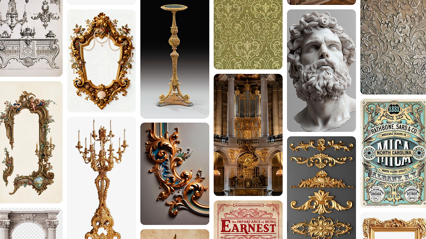
For me, that was ornate frames, worn textures, marble sculpture, curved furniture, 19th-century typography and muted, earthy colors.
A test I’d suggest: swap your name for someone else’s. If the site still makes perfect sense, you have a template, not a portfolio.
Once I had the direction, the decisions got a lot easier:
- Light, not dark. Aged paper instead of a black void.
- Type with character. Bodoni Moda for headlines, Cormorant for everything else.
- A small, deliberate palette. Oxblood, sepia ink, gold and olive.
- Ornaments as engraved line work. Thin SVG fillets and flourishes, not photographs pasted everywhere.
- Realism only where it counts. The gilded portrait in the hero is the one photorealistic moment. Everything around it stays quiet so that piece can be loud.
That last point matters more than it seems. Maximalism doesn’t mean everything shouts at once. It means choosing what gets to be extravagant.
Same structure, opposite style
What I didn’t do was rebuild the site. It’s still Astro and Tailwind, and the layout, the sections and the content stayed almost exactly where they were. If you put the old and new heroes side by side, the bones are identical: nav, tagline, name, intro, two buttons, photo on the right.
Only the skin changed, and I think that’s an argument in itself. If your structure and your styling are cleanly separated, a radical redesign is a design problem, not an engineering one. You don’t need to rewrite anything to stop looking like everyone else. You need to decide what you want to look like.
How I got there
I’m a developer, not a designer, so I didn’t start in a design tool. I started with a Pinterest board: frames, busts, damask patterns, old playbills, a Victorian type specimen. Then I used Claude Design to turn that board into style tiles, so I could test type, color and ornaments before touching any code. Once the direction held up, I implemented it with Claude Code.
The tools made it fast to explore. But the direction came from the board — from knowing what I liked before asking anything to help me build it.
A few things worth knowing
It’s a risk. Some people will find it too much, and that’s fine. A portfolio that tries to please everyone ends up looking like everyone else’s.
Personality isn’t an excuse for bad UX, though. The navigation, the readability and the contrast still have to hold up. The new hero says I build interfaces “that work as they should and feel as they ought”, and the site has to live up to both halves of that sentence.
If your portfolio feels like something you set up rather than something you made, it’s probably worth a second look. It’s the one site where you’re the client, so you might as well build it for yourself.