Lava UGC Agency · 2025
Lava UGC Agency
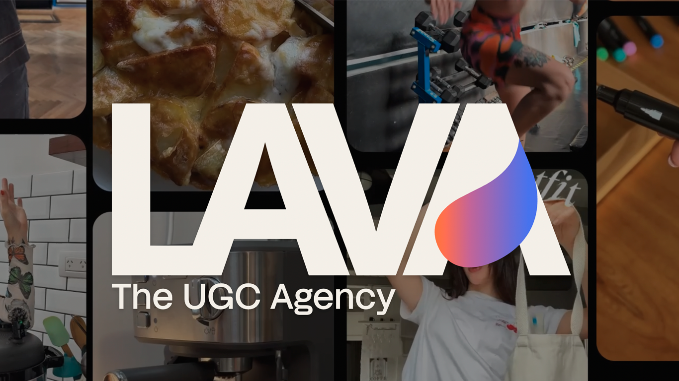
A high-impact landing page for a UGC agency connecting brands and creators — bold 3D visuals, smooth scroll, and zero compromise on performance.
- astro
- tailwind css
- lenis scroll
The problem
The client came in with a tight deadline and a clear ambition: a landing page for a UGC agency — the kind of business that lives and dies by first impressions, since its entire job is connecting brands with influencers and influencers with brands. The site had to sell that energy on sight. Bold, animated, alive.
The catch was the usual one in projects like this: the more visual flair you add, the easier it is to tank performance. Heavy animations, rich visuals, smooth scrolling — all the things that make a site feel premium are also the things that make it feel slow if you’re not careful. The brief wasn’t “pick one.” It was both, on a deadline that didn’t leave much room for trial and error.
The process
Astro was the obvious starting point. For a single landing page, it’s hard to beat — ship almost no JavaScript by default, and only load what the page actually needs. That foundation gave the design room to be ambitious without paying for it in load time.
On top of that, Motion handled the animations and Lenis Scroll smoothed out the scrolling experience, with Tailwind CSS driving the styling system. I owned both the design and the development end to end, which meant every animation decision could be made with performance in mind from the start, not bolted on after the fact.
The client had already done the brand work — a defined logo, color palette, and typography — so the design challenge wasn’t inventing an identity, it was translating an existing one into something that felt native to the web and to motion.
The biggest technical challenge was the 3D elements the client wanted throughout the site. Rather than building full 3D assets, I generated them with Adobe Firefly and then layered a parallax effect on each one to fake the depth a real 3D render would give — the kind of trick that reads as three-dimensional without the performance cost that real 3D usually carries. Lenis Scroll did a lot of quiet work here too, smoothing the scroll just enough that the parallax reads as intentional depth rather than visual noise.
The hero needed a video, and video on a hero section always carries a UX risk: there’s a beat where the page is technically “loaded” but the thing the visitor actually came to see isn’t ready yet. The fix was a loading screen that tracks the video’s readiness and only releases the page once it’s actually good to go — a small detail, but the kind that separates a site that feels slow from one that’s simply being honest about load time.
The outcome
The site landed on deadline, and the performance held up — every asset was optimized with that constraint in mind from day one, so the animation-heavy experience never came at the cost of speed. Reveal and parallax animations throughout the page are what give it its sense of motion and life, and the build closes with a footer reveal that ties the whole scroll experience together.
What I’m proudest of here isn’t any single animation — it’s that the site manages to feel premium and move fast at the same time, on a timeline that didn’t allow for guesswork. For an agency whose entire pitch is connecting people through compelling content, the site itself had to be proof of that same instinct: striking, but never at the expense of how it actually performs.