TechGuru · 2024
TechGuru
A from-scratch identity and website for a technical service company specializing in analytical instrumentation — built with creative freedom, then extended a year later to speak two languages.
- react
- gsap
- i18next
- figma
The problem
TechGuru provides technical service for analytical instrumentation — Hewlett Packard and Agilent Technologies equipment used in laboratories. It’s a precise, technical field, and their website was anything but: an outdated, barely usable WordPress site that did nothing to reflect the expertise behind the company.
There was no brand to lean on, either. No color palette, no typography system, no defined visual identity — just a logo. Everything else, design and development alike, had to be built from the ground up.
The process
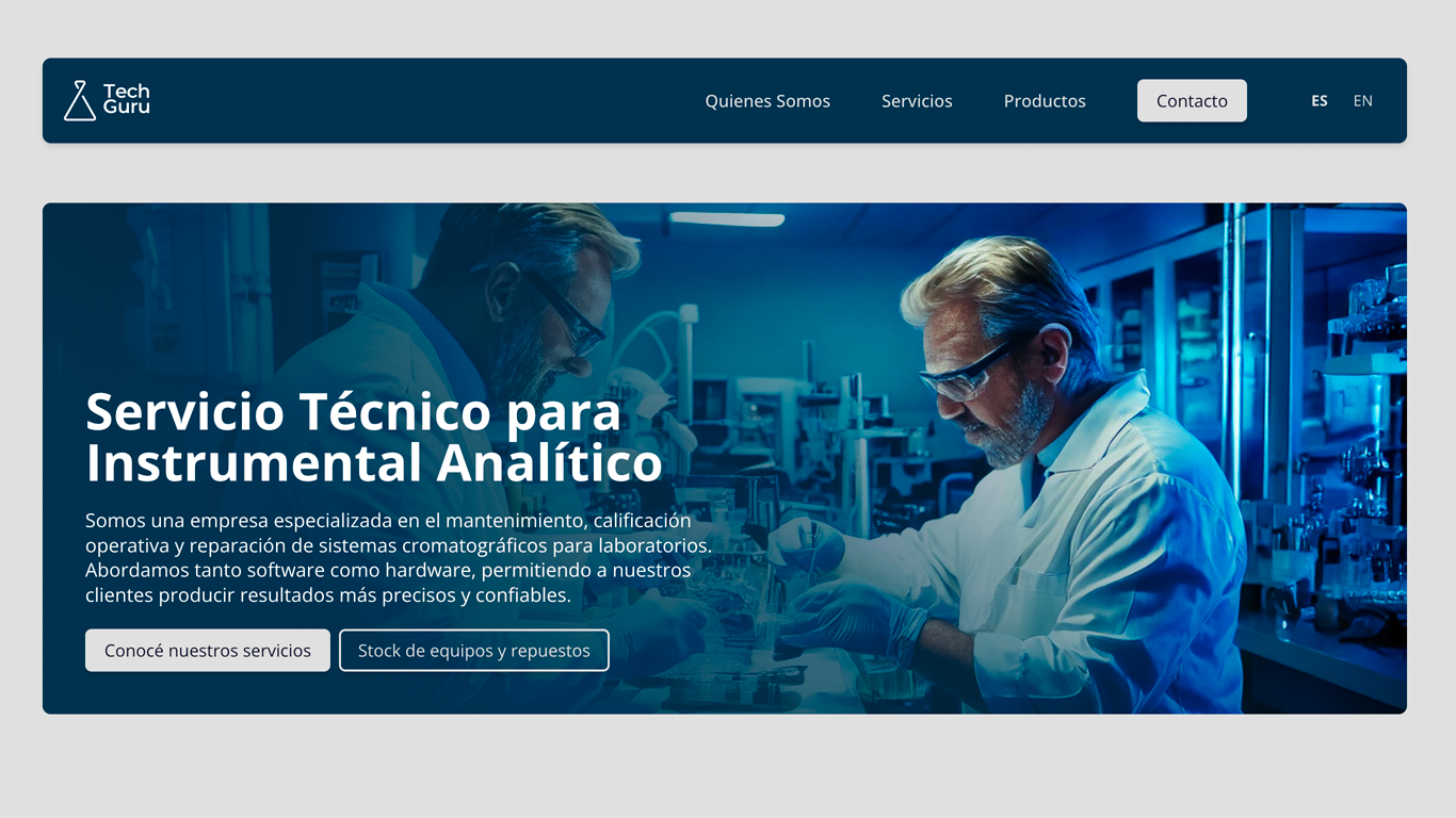
Starting with nothing is its own kind of challenge, but it also meant full creative freedom. I designed the site in Figma before writing a line of code, which made it possible to work through layout and visual identity decisions early, without the cost of redoing built components later.
The one constraint that shaped every design choice was the client’s industry: laboratory equipment servicing is a conservative, trust-driven field. So while I pushed for animations that felt alive rather than static, every motion choice was tempered by that context — bold enough to feel modern, restrained enough to still read as credible to a lab manager evaluating a service provider.
GSAP handled those animations, giving me the control to choreograph movement precisely rather than relying on generic transition libraries. The site itself was built in React with Vite, styled with Chakra UI for a consistent, accessible component system. Since there were no existing photos or illustrations that fit the brand, all imagery on the site was generated with Adobe Firefly — built specifically for this project rather than sourced from a generic stock library.
The written content — including the Commitment, Mission, and Vision sections — came directly from the client, so the design work was about giving their voice a structure and visual weight that matched the seriousness of what they do.
A year after launch, TechGuru came back with a new request: multi-language support, as the business started expanding beyond its original market. I implemented this with i18next, building a smooth English/Spanish toggle with no page reloads — keeping the experience as polished as the original site while extending its reach.
The outcome
There’s no hard analytics to point to here, but the clearest signal of success came from the client itself: a year after the site launched, they came back asking to invest further in it rather than start over somewhere else. That’s not a vanity metric, but for a service business it’s the one that matters — the site held up well enough, long enough, that expanding it was the obvious next step instead of replacing it.
The multi-language implementation turned out particularly well — smooth, instant language switching with i18next, no reload, no jarring transition. For a technical service company in the middle of expanding its footprint, that’s exactly the kind of detail that should be invisible when it works.